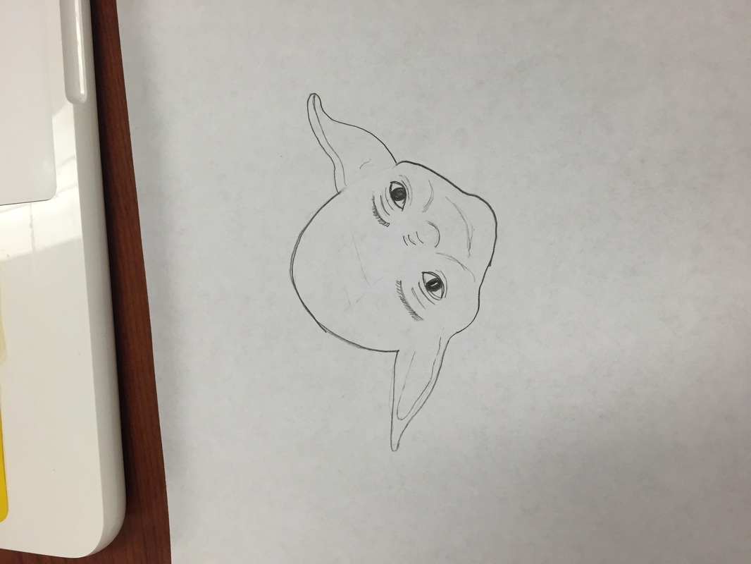
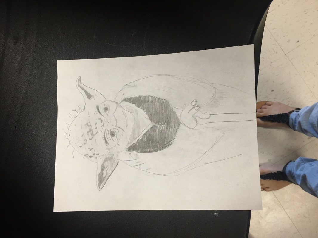
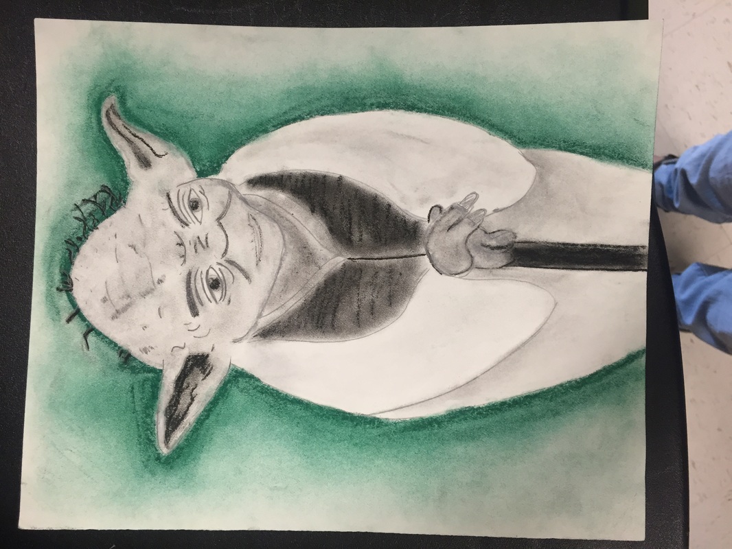
First off, my drawing is of Yoda... hope you can tell. The theme for this week was power! Yoda is the most powerful Jedi, right? He plays the role of being weak and old but he really is the best. For me, I wanted to capture the image of Yoda when he's calm. I looked at two pictures! One of his head and the other of his body.
When I first started working on this piece, I had my sister in my mind. She LOVES the Star Wars series. I know I'm not the best artist, but she loves when I draw. She told me in advance that she wants to frame my Yoda for her apartment. For me, this really motivates me to try my best. Coincidentally, Yoda and power go hand and hand in this case. In my personal opinion, I like the pencil drawing or rough draft better than the charcoal outcome. Pencil was more precise and detailed. The charcoal smudged and blended harder than the pencil did. I love how the background for this makes Yoda seem like he is glowing in green. From a fellow classmate, my drawing got compared to a "football shape". I hope when people see this drawing they don't just see the overall shape, they see it's actual detail. Should I go back in and make the green darker?
1 Comment
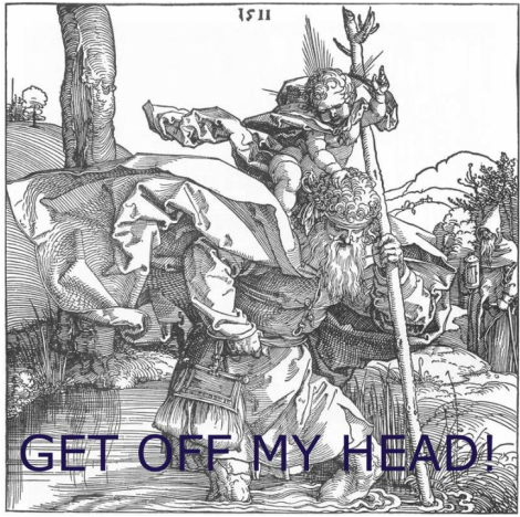 ST. CHRISTOPHER CARRYING THE INFANT OF CHRIST BY DUER
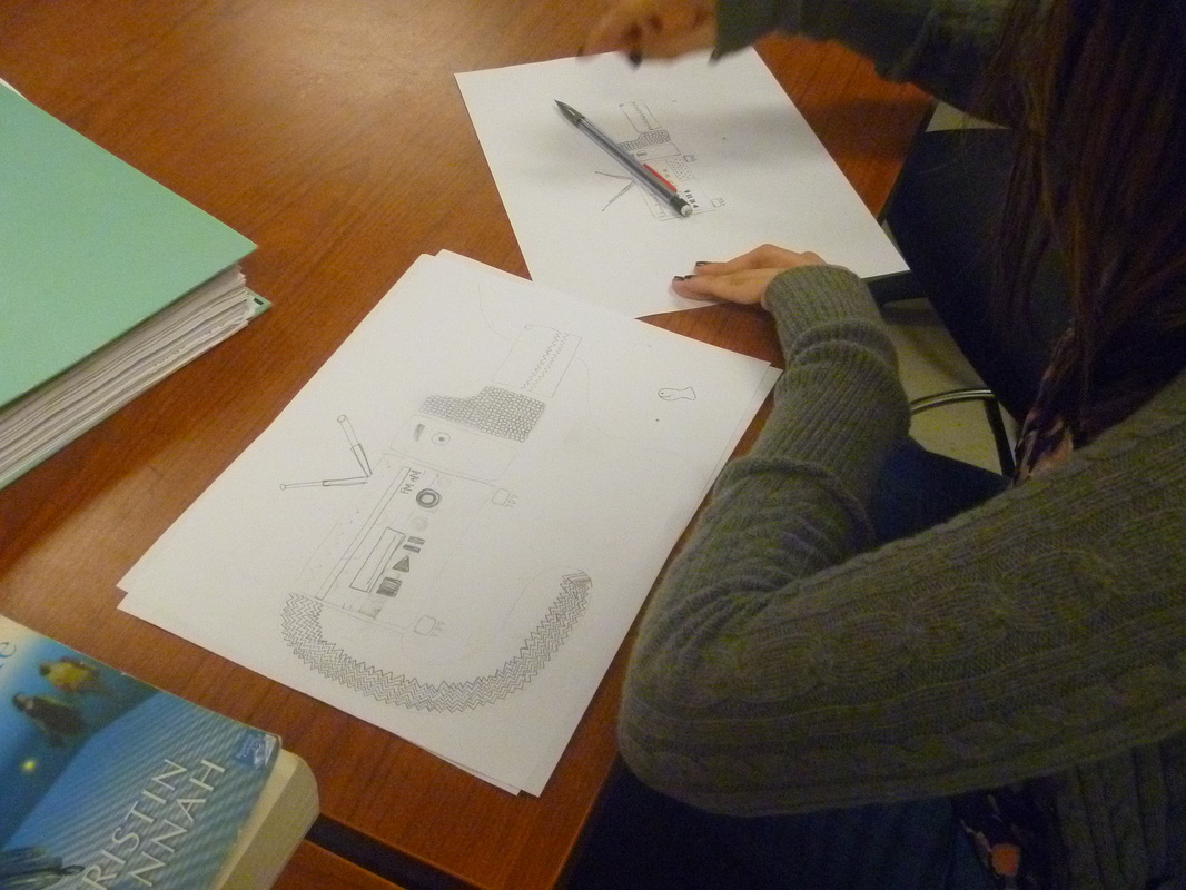
ALBRECHT DURER 1511 WOODCUT 500 X 497 Self portraits. I had no idea that it would be so difficult to draw myself. I know I have "big" eyes, dimples, and a circular head, haha. To start out my drawing, I literally used a picture on my phone zoomed in and got a piece of paper and measured the width. This was my "ruler", I drew the right eye the best I could and then used that ruler reference to guestimate where everything else should be. I know for a fact, my eyes are the same. One closes a little bit more, I had a tough time getting it right. Bottom line, my drawing is like a cartoonish version.... when it was suppose to be traditional. I'm just being hard on myself I think. For my self portrait, I wanted it to be original. I chose to do it in pencil, no charcoal. No lie, I chose a picture with the smile I use to no one thinks I'm mad. It's almost like a fake plastered smile, I think everyone has this smile. I wanted to draw this facial expression, because this is how I hope people view me. Also, no braces, LOL. Like I mentioned above, I had a really tough time actually getting my self portrait to look like me.  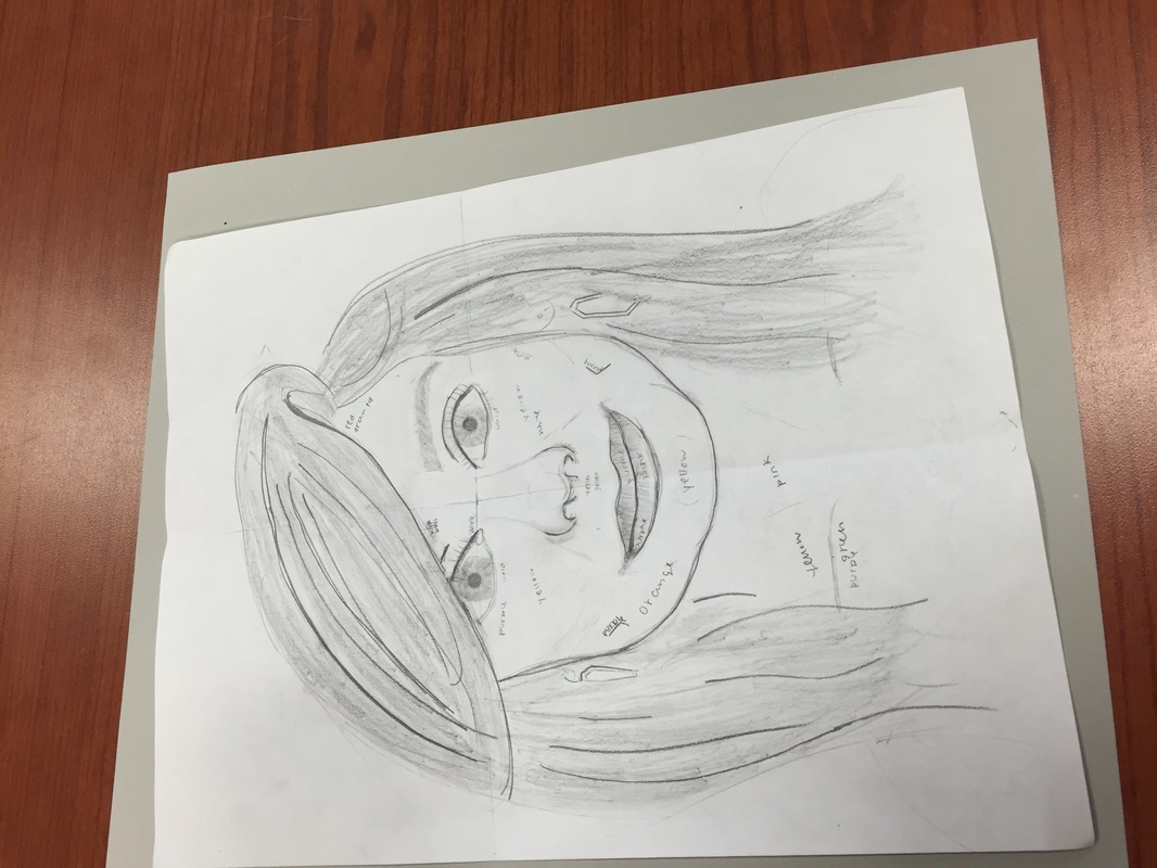 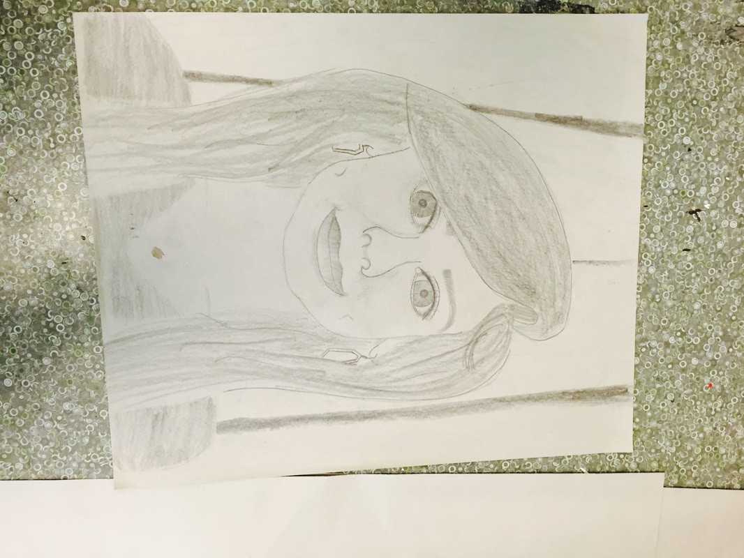 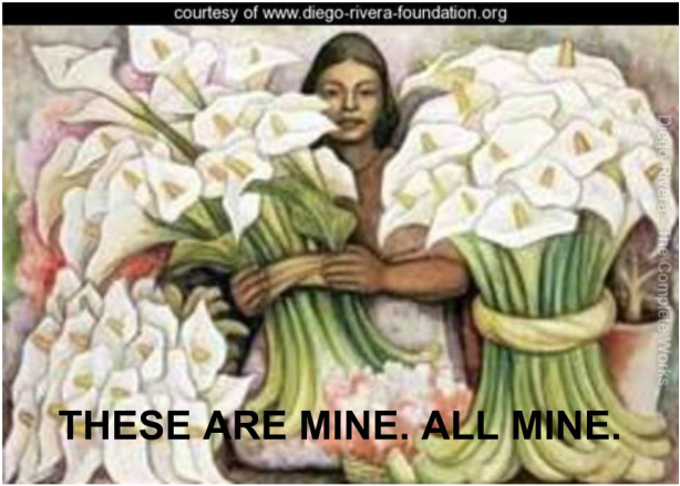 Diego Rivera
Vendedora 1938 mural painted on fresh plaster, acrylic coating protects the painting. 25 X 17.5 inches This weeks theme in art was "surrealism." I had a really really hard time coming up with what I should draw. I ended up drawing an older version of a radio. Since it was rectangular, I decided to draw abstractly. In my head I just thought of like clipping the body of an alligator into "frames." I didn't want to just leave the radio alligator in the air floating, so I pondered some thoughts. I ended up wanting to go with something totally opposite from electronic stuff, candy. I made the background candy themed. I chose to do this in colored pencils just to challenge myself. I personally don't like colored pencils, because I like bold colors and it takes a while to build to my liking. The colors I chose didn't really show good contrast. I hope my drawing inspires people to be creative! I chose random objects to make this and tried to make it look as fun as possible! My art work is simple, yet very thought out. Also, my favorite color is used frequently! I liked showing a little bit of me in this drawing. Strangely, I'm very interested in alligators because of the way they do the death roll. That is probably why I draw it! 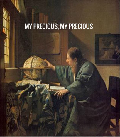
ARTIST: JOHANNES VERMEER
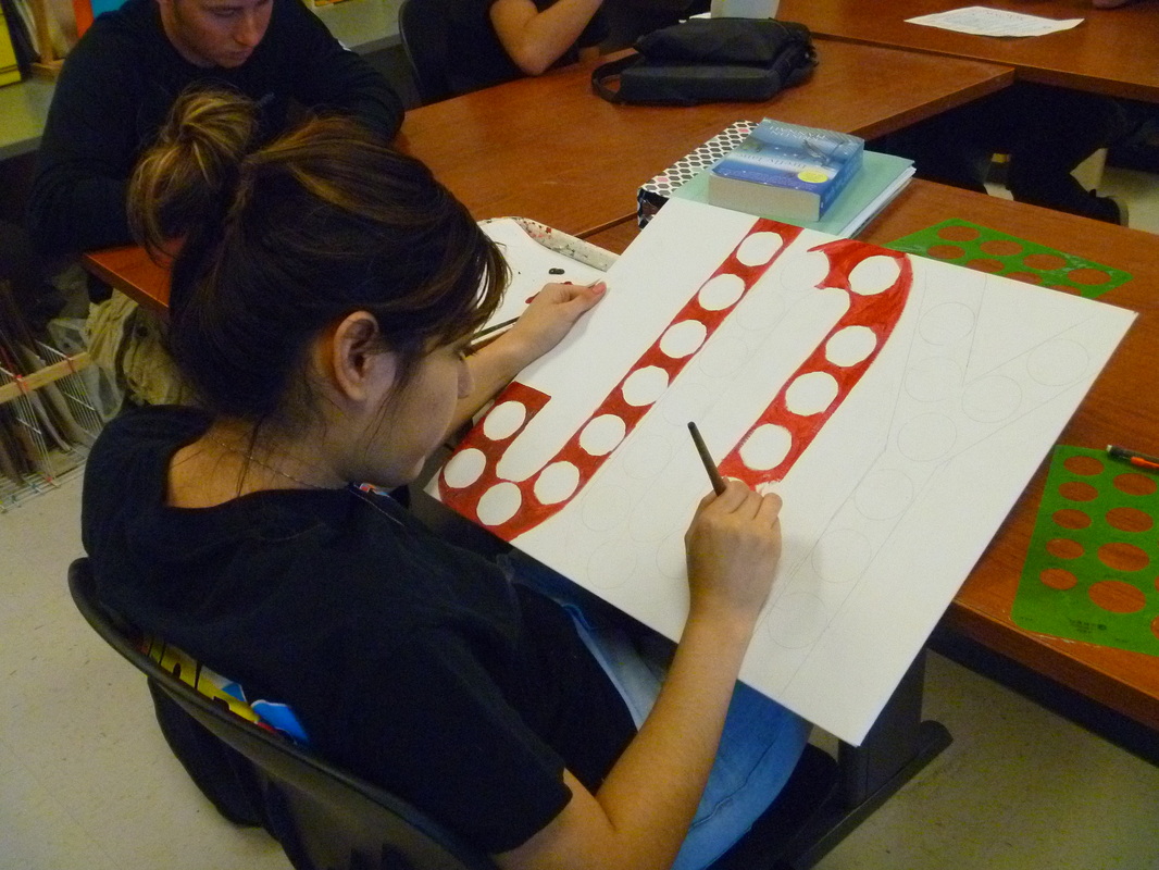
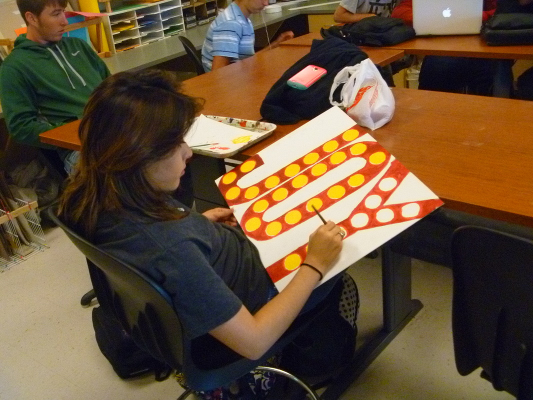
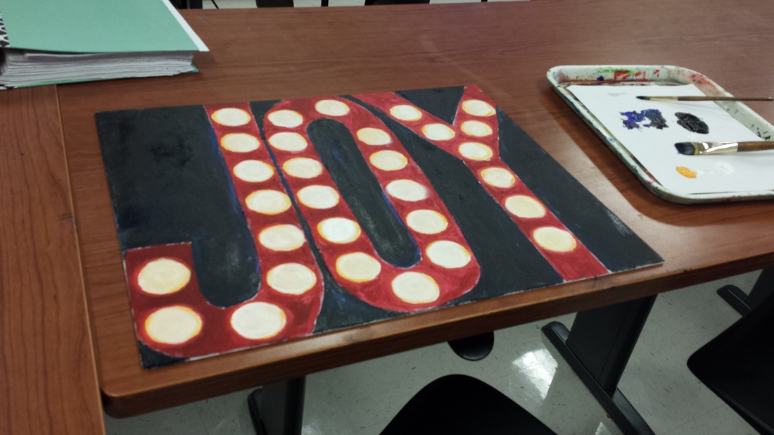
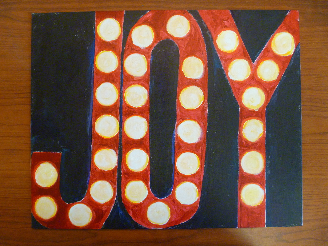
ART PIECE NAME: THE ASTRONOMER YEAR: 1668 MEDIUM: OIL ON CANVAS SIZE: 20 X 18 INCHES This weeks theme was LIGHT. I had a rather tough time figuring out what I wanted to draw. I ended up deciding to draw old timey movie theater letters! I chose the word "JOY" because in my mind when I think of light I think of happiness and brightness. It just so happens that the movie theater letters use light as well, so it worked both ways in my head. I started out just free handing the J-O-Y. I was so off, it wasn't even funny. I had to guestimate how wide each letter should be and the straightness. Good thing I got a circle stencil! If not, this whole art piece would have been a hot mess. I first filled in all the circles with just a straight warm toned yellow. I just didn't cut it for me. I need for dimension for the "light bulbs". I got white paint and swirled it into the yellow, so it could look like the buzz from the light bulbs. Since in my free-hand marks... The background was ruined. In this case, it really helped to make this piece better. The dark background helped the letters POP. I used a mixture of black, purple, & blue to give color in the dark black. I would like to call this art piece: "FIRST DECORATION FOR MY DORM." Can you guess why? Haha, I plan on using this canvas in my dorm for college next year! So far all the art pieces I have made, I would looooove to incorporate in my room somehow. I like how this drawing has a dark background but a bright message! I forgot to mention. I used a canvas board, with acrylic paint to make this art piece! I think the media used really helped the colors to seem more glossy and vibrant. The final piece is clean cut. I like how the brightness of colors in the letters rest against the dark background. I hope when people view this, they don't just see a word. I hope they look deep into the meaning. The theme is light. The artist, me, chose to draw "light bulbs" in letters. She chose the word "joy". Joy means to have a heart filled with happiness, no sorrow. Sadness can link to a dark, heavy heart. Which is opposite of light, so the artist draw this for happiness. I really hope the people who see my canvas have these thoughts running through their minds. 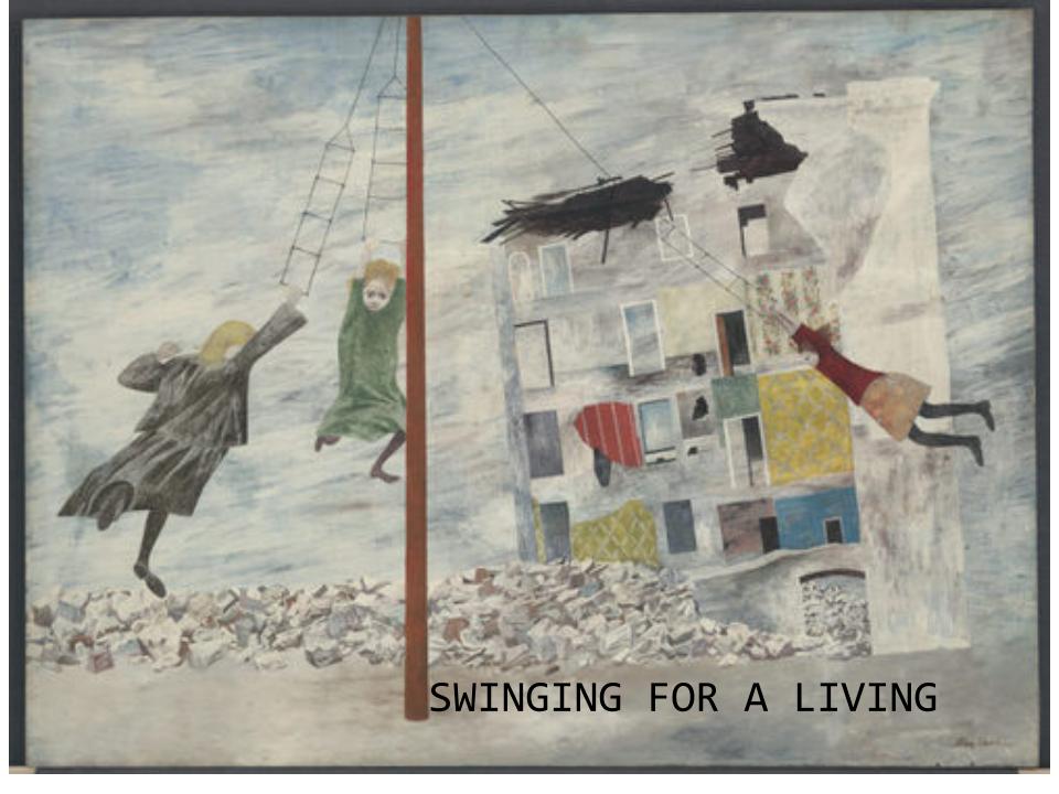
LIBERATION (1945)
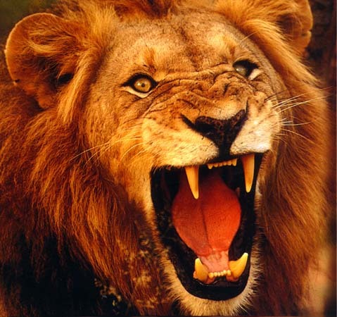
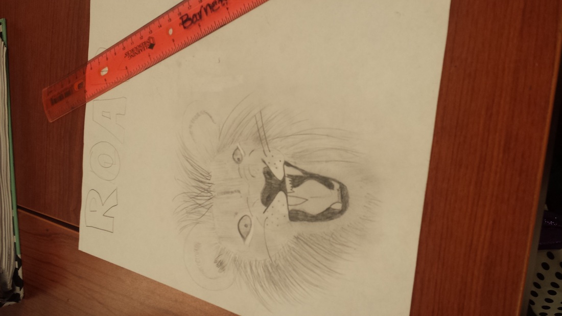
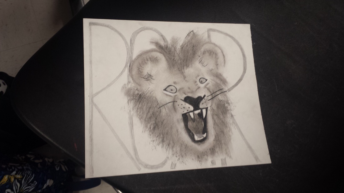
BEN SHAHN GOUCHE ON BOARD 29.75 x 40 INCHES This past weeks unit was sound. I chose to draw a roaring lion.. I had to chose weather to draw my lion out in color, or to go with black and white. I had the image down below for inspiration, I sketched out the mouth first in pencil and went from there. I spent more than enough time on my sketch. I basically drew the whole lion out on the white paper and all in pencil. I wanted to enlarge the drawing, but then it like altered the whole face so I gave that idea up. I used a light box to trace the same image in actual drawing paper. I wanted the drawing to be black and white based. Without even practicing I grabbed the charcoal and just went at it! I ended up really liking the end result, and Mrs. Barnett helped inspire me to put "ROAR" in the background the way I did. While I was randomly coloring my lion with the black charcoal I was really nervous. I'm a really hands on person, so I chose to smudge the charcoal all over and use my eraser like my best friend. I didn't want the image to be all muddy, so I used the grey and white charcoal as well. Sidenote! The reason to why I chose to draw this lion was simple, I like cats. In my opinion, regular cats have too much detail with the fur and everything, and a lion was easier to draw. When people see my drawing I hope they feel powerful and feel like they can literally hear the lion roaring, on top of a cliff lol. My lion is loud and proud, I hope I drew it well enough to get this little point across. Whenever people view my artwork, I hope they can see me in it. I feel all my artwork kind of seems the same and has the same message. Nature. 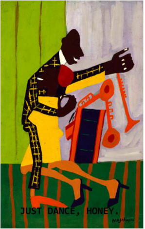
Artist: WILLIAM H. JOHNSON
Painting name: JITTERBUGS (II) Year made: 1941 Medium: OIL ON PAPERBOARD Size: 24 x 15 3/8 INCHES | MegAl new to this art stuff... ArchivesCategories |
 RSS Feed